
Tag Archives: Interior Design
Decor-Fabulosities…

Three things that I’m totally obsessing over these days with home interiors are…layered rugs, tables full of plants, and folding screens.
Yes, folding screens, I’m totally LOVING them. Secretly I have been coveting them for years. More please!

Next thing that has been rocking my world is layered rugs, not just a rug over a sisal as seen above. Oh no…loving multiple rugs creating a layered quilt of colors, textures and shapes.

And my last must have, is tables full of plants. Indoor gardens. Well, garden…might be stretching it. More like a small collection.

Instead of scattering them around, place them all in one area, most importantly use heights and textures in your presentation. This makes one hell of a great visual presence to any room, especially a main floor living area.

Design on People,
Inspire
Design Stalking…
CB 2 has been Gooped!

Being from Chicago the birthplace of Crate and Barrel and it’s offshoot CB 2, I always enjoy watching the visual presentation of their product development. Plus, CB 2 appeals to my frugal side for great interesting finds.
With that said…welcome to the latest collaboration of CB 2 and Goop. This one I’m not so excited about. Though the lines of the products are great, very Parisian salon or London loft “vibe”. It’s the price points where they lost me.
We’re constantly being presented with newer, cheaper, more…concepts from every angle. This collaboration of CB 2 is nothing new in the importance of always needing to keep fresh and relevant in the marketplace. But this tried and true blogger just loves to keep it REAL and simple no matter what the “marketplace” is stating as the new must-have or best direction.
CB 2’s other designer and artists I find much more interesting and with realistic price points too. Such as Bryn.

My favorite aspect of the CB 2 site, besides great new products. Is when they interview the designer asking them simple questions on their inside perspective.
https://www.cb2.com/blog/bryn-namavari-2/
LOVE that…it’s a little like driving around at night and looking into people’s houses to see how they decorated.

I will always be heading to CB 2 for major basics like this mirror. But the Goop collection? Here is one of the products, a fantastic black basket. I’m sure that it’s made from the finest abaca hemp. Very Goopie!
But sorry Gwenth, not for $299.00 for one!
Design on people,
Inspire
Max it OUT…

Wow…this particular style is not for the faint of heart. As an artist and a designer, I can totally see the beauty. I just don’t know if the heaviness of the style and over accessorization is something that I would like 24/7.
I’m a little more clean lines and with a slight impact on accessories. Not so crazy about the “I just cleaned out the local Hobby Lobby or T J Maxx Home and threw it all in one room” look!
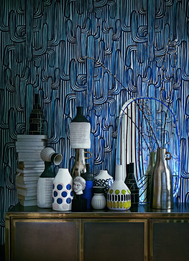


There is a fine line between artistically placed versus…pile it on! This is a dangerous path for some…because this style can go bad real quick. It could just look sloppy…and look like mid-class clutter!

LOVE..the wallpaper on the ceiling! 5th wall impact!

Design On…People!
Inspire
Timeless Furniture…

I’m obsessed with these chairs…classic art deco club chairs!

This particular chair along with a Chesterfield sofa…TIMELESS! They can be dropped into any interior and you instantly warm it up with its effortless elegance.

The more weathered the leather…the more I personally like it!
Design On…People!
Inspire
Design Show or Trainwreck TV…

Trading Spaces returns. Is it design show or mockumentary? Seriously, I’m sure that there were many moments where they actually did some decent make-overs. But when you see and hear about some of the past “creations” you need to ask yourself…is this for shock purposes?
I know that there are many taste levels out there in the “design” field. But when you see these gigantic FAILS…you have to wonder if this is all staged.
The biggest insult of them all…

Okay, the only answer acceptable to me is the designer was drunk and the neighbors truly hated each other.
And I heard this epic mess took the production team 18 hours to fix after completed!


Yep…she was drunk!

Okay, on this one…the designer was drunk, high and she knew she could plead temporary insanity in any civil case against her after they created this abysmal mess!
If I do watch it…this will be the reason why! Que…cheesy music!


Nothing left to say, people!
Design on,
Inspire
Decor Trends 2019 LOVE it or Leave it…

Trends: discovering what is new and exciting is always kind of interesting whether you’re in the market for a change or not. Some designer’s go to furniture markets twice a year every year, which can be quite a feat, even for seasoned veteran’s. But, that’s just one of the areas where you can see the newest in home decor for the CONSUMER.
I LOVE hearing about the latest design trends! But many will still prefer to opt out of trends! Why? Well, mainly because they’re a lot of tried and true preferred traditional styling for the home. Usually, those who prefer traditional decor prefer the CLASSICS…hoping there will be less of a chance of having a date stamp on the items they buy. Unfortunately, no matter when you buy a traditional piece or any other particular “style” direction…your lucky if you get a good 10, the most 15 years out of it…before it starts to look old and dated.
My personal style direction is a decor of mixed fushion when styling a home. I like to combine the new feels with the old (vintage) for that eclectic look. But my vintage pieces will still need to have updated fabrics on them. Otherwise, it’s just an old sofa, chair or bench!
I feel that no matter what your preferred design direction is traditional, new traditional, mid-century, modern, or just that fabulous “lived in look.” Having an updated kitchen and bath are the major go too’s for that FRESH and fabulous look, plus it’s great for resale.
With that stated, even though these photos depict a more modern aesthetic, there are ways to incorporate modern touches to ALL design styles and feel. So with that said…here is what HOT and new for KITCHENS 2019 and going forward.

Unique or hidden vent hoods!

Flat front cabinets…with hidden or no hardware!

Waterfall countertops on islands…LOVE 4″ depth myself!

Continous sinks (LOVING the concrete) with light to medium wood tone cabinets. And of course still seeing painted cabinets too!

LOVING the white subway tile…so fresh and classic!
WALLS…not just backsplashes…of marble! Chevron floors!

Float cabinetry and use mixed metals! This is my favorite way of doing mixed metal look, use black or oil rubbed bronze combined with a gold or a silver!
Design on people,
LOVE-Inspire
LOVE Me A Touch of Rattan…

It’s probably my LOVE for a great eclectic/touch of bohemian…interior design choice…for the reasons that I crave for a GREAT rattan chair in the corner!

Are they the most comfortable chair in the room? Hell no! But they’re there for the form and not the function!

To me, a room should be a layered with textures, and this is just another way to add texture to the room!

Who Doesn’t Like A Good Tile Job…


When creating a new tile presentation or re-doing an old one…why not GO ENCAUSTIC?
If you’re designing a room or entire house most consumers main objective is to create something that is timeless. This is virtually impossible, the only way you can possibly create timelessness is with pure white…but even with that color choice…tile and design sizes change through the decades.
For instance what you like now, might not be what you would like or fashionable 10 years from now. Plus, the colorways that are currently strong, will not be the same tones desired 10 to 15 years from now.
Take green for example…90’s it was Sage Green, 2000’s it was Chartreuse Green’s, and now for 2010’s it Emerald Green.

So trying to stay classic and clean? Stay neutral!
Though beige years are really “so last decade”, we are now currently enthralled with the gray tones. Or dare I say “gray-eige”, for those who still embrace, tans and beige tones!


TILE ON!
Inspire
Powder Room Surprise…

What I LOVE about a powder room is that they can be such an element of surprise!
Even for those who tend to decorate on the conservative side. I see and hear it on a daily basis those that want that element of impact as you open the door to their powder rooms.
 Whether that drama is created through tile, paint or wallpaper…today’s consumer wants to step out-of-the-box a little more…and that box is anything typical!


So…let the powder room be your avenue to go a little crazy with a color, tile or design!
